Look at a traditional world map and Africa can appear surprisingly small.
Place Greenland beside it and the difference can look even harder to believe. Africa is actually about 14 times larger than Greenland.
The reason is the map projection most people have seen since childhood: the Mercator projection.
Now, the United Nations wants the world to start looking at the map differently.
Why does Africa look smaller?
Gerardus Mercator introduced his famous map projection in 1569. It was designed mainly for navigation.
The projection preserves directions well, which made it useful for sailors. But it does not preserve the true size of land areas.
The distortion becomes greater as you move towards the North and South Poles.
That makes Greenland and parts of northern Europe appear much larger than they really are. At the same time, regions closer to the Equator, including Africa, appear smaller.
The result is a map that is useful for some purposes but gives a misleading impression of relative land size.
Africa covers about 30.4 million square kilometres. Greenland covers about 2.2 million. Yet on the familiar Mercator map, they can look almost comparable.
That difference has become the centre of a campaign led by African countries to “correct the map”.
The UN wants a different picture
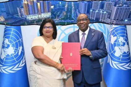
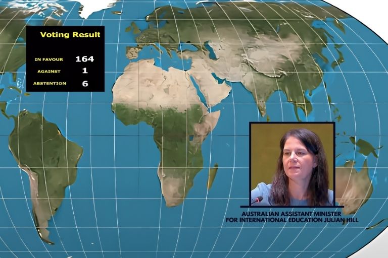
The UN General Assembly on Friday backed a resolution promoting the Equal Earth projection, which was developed in 2018 to show the relative area of the world’s land masses more accurately.
The resolution passed with 164 countries voting in favour. The United States was the only country to vote against it, while six countries abstained.
Togo led the initiative with support from the African Union. The resolution does not ban the Mercator projection. It is also not legally binding.
Instead, it encourages governments and institutions to use maps that represent the size of continents more accurately, including in education and digital platforms.
That distinction matters.
Mercator still has practical uses, particularly in navigation. The UN move is mainly about how the world is represented in education, public information and other settings where relative land size matters.
For people who have spent decades looking at the same familiar world map, however, the biggest change may be much simpler.
Africa may finally start looking like Africa.
The continent is not a small landmass sitting below Europe.
It is the world’s second-largest continent by area and is large enough to contain the United States, China, India, Japan, and much of Europe within its boundaries.
The new map will not change Africa’s physical size. It may change how millions of people understand it.
More:
Nvidia to Buy Hugging Face for $12.93 Billion in Open AI Bet
Certification & Recognition United Nations (UN)
Last modified: September 5, 2026